
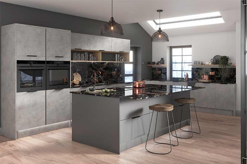
A kitchen renovation is one of the most significant investments you will make in your home. While layout, cabinetry footprints, and appliance selections form the structural backbone of the room, the finishes you select deliver the ultimate visual impact. Finishes are the surface materials, textures, and sheen levels of your countertops, backsplashes, hardware, flooring, and plumbing fixtures.
Selecting the right finishes requires balancing aesthetic preference with long-term durability. The perfect combinations tie disparate design elements together, making a kitchen look cohesive, intentional, and balanced. This guide provides a strategic framework to help you navigate the process of selecting and pairing kitchen finishes like a professional designer.
Establishing a Design Anchor
The sheer number of choices in a showroom can quickly lead to decision fatigue. To avoid a disjointed final look, start by identifying a single design anchor. The anchor is the primary visual element that serves as the foundation for all subsequent material choices.
Typically, the cabinet color or the countertop material serves as the anchor because these two elements occupy the largest physical and visual footprint in the space.
Choosing Your Countertop First
Many designers prefer to select the countertop as the anchor material. Natural stone, quartz, and quartzite slabs exhibit unique veining, color variations, and undertones that are impossible to alter.
-
Natural Stone and Quartzite: These materials offer organic, unpredictable patterns. If you choose a dramatic slab with heavy veining, your remaining finishes should be understated to prevent visual chaos.
-
Engineered Quartz: Quartz offers exceptional uniformity and consistency. Choosing a neutral, solid quartz countertop gives you total creative freedom to select bold cabinet colors or an intricate tile backsplash.
Aligning Cabinetry and Walls
Once your anchor is set, evaluate your cabinetry finish. Cabinets dictate the overall style of the room, whether traditional, transitional, or modern minimalist. The finish on your cabinets, whether painted, stained, or high-gloss acrylic, establishes the baseline texture of the kitchen.
The Art of Mixing Metals
The days of matching every faucet, light fixture, and cabinet pull to the exact same metal finish are over. Mixing metals adds layer, depth, and a curated feel to a kitchen, preventing it from looking flat or sterile. However, successful metal mixing requires adherence to a specific formula.
Define a Dominant Metal
Select one primary metal to carry approximately 70% of the visual weight in the room. This dominant metal is typically applied to large-scale items, such as your main kitchen faucet or the hardware across all peripheral cabinetry. Matte black, brushed nickel, or oil-rubbed bronze serve as excellent primary anchors.
Select One or Two Accent Metals
The remaining 30% of the fixtures should feature an accent metal that creates a deliberate contrast.
-
Cool and Warm Contrast: If your dominant metal is a cool tone like chrome or stainless steel, bring warmth into the room with unlacquered brass or brushed gold light pendants over the kitchen island.
-
Matte and Polished Contrast: Pair a matte finish with a polished finish. A matte black faucet provides a stunning counterpoint to polished nickel cabinet latches, reflecting light in different ways throughout the day.
Balancing Sheen and Textures
A common mistake in kitchen design is using the same sheen level across every surface. A kitchen filled entirely with high-gloss finishes will feel cold, clinical, and prone to blinding glare. Conversely, an all-matte kitchen can appear flat and dark. The key is strategic contrast.
Countertop and Backsplash Harmony
Your countertop sits perpendicular to your backsplash, making their relationship highly visible. If you select a polished quartz or polished marble countertop, consider pairing it with a matte or textured tile backsplash, such as Zellige tile or tumbled stone. The variations in surface texture break up light reflections elegantly. If your countertop features a honed or leathered matte finish, a glossy subway tile or a mirrored glass backsplash will inject life and light back into the workspace.
Flooring Textures and Maintenance
Kitchen flooring must bridge the gap between aesthetic appeal and practical safety.
-
Hardwood and Engineered Wood: A matte or satin polyurethane sealer protects the wood while highlighting the natural grain, hiding footprints and dust effectively.
-
Porcelain and Ceramic Tile: Avoid high-gloss, polished tiles on kitchen floors. When wet, these surfaces become dangerously slippery. Opt for matte, textured, or natural stone finishes that provide adequate traction underfoot.
Coordinating Backsplash and Lighting Finishes
The backsplash and lighting fixtures occupy the eye-level zone of the kitchen, meaning they directly dictate the mood and perceived scale of the room.
Creating a Visual Focal Point
Decide whether your backsplash will be a background element or a focal point. A full-height slab backsplash matching your countertop creates a seamless, luxury aesthetic that elongates the walls. If you choose this route, keep your lighting fixtures minimal and architectural. If you select an intricate mosaic or a bold geometric tile pattern, ensure your light fixtures feature simple lines and transparent glass shades so they do not block the view of the tile artwork.
Embracing Under-Cabinet Lighting
The finish of your materials will look drastically different depending on the temperature of your light bulbs. Warm materials like gold hardware and wood stains look best under warm-white light (2700K to 3000K). Cool tones like marble, chrome, and gray cabinetry benefit from cool-white light (3500K to 4000K). Ensure you install under-cabinet LED tape lights to illuminate your chosen countertop finish properly without casting shadows.
Frequently Asked Questions
What is the difference between a honed, polished, and leathered countertop finish?
A polished finish is highly reflective, smooth, and glossy, highlighting the full color and depth of the stone but showing fingerprints and scratches easily. A honed finish is smooth but completely matte, providing a softer look that hides scratches well but leaves the stone more vulnerable to stains if not properly sealed. A leathered finish is a textured option created by brushing the stone, resulting in a matte surface with subtle, dimpled ridges that excel at hiding water spots, smudges, and minor imperfections.
How do I prevent my kitchen hardware from tarnishing or changing color over time?
If you want your hardware to remain identical to the day you bought it, select finishes with a clear lacquer coating or choose physical vapor deposition (PVD) finishes, which are highly resistant to corrosion and wear. If you prefer an aged, historical look, select unlacquered brass or living finishes. These materials lack a protective coating and deliberately react with the oils on your hands and oxygen in the air, developing a natural, darker patina over time.
Can I mix different styles of cabinet hardware, such as knobs and pulls, in the same kitchen?
Yes, combining knobs and pulls is a standard design practice that enhances functionality. A reliable rule of thumb is to use knobs on upper cabinet doors and pulls on lower drawers. For large pantry doors or built-in trash pull-outs, consider utilizing heavy-duty appliance pulls. To maintain design continuity, ensure all the hardware pieces share the same metal finish or belong to the same design collection.
Why does my white tile backsplash look yellow or blue after installation?
This optical illusion is caused by grout selection and surrounding light reflections. If you use a bright white tile with a warm beige grout, the tile can take on a cream or yellow cast. Furthermore, light bouncing off vibrant green lawns through a window or reflecting off dark blue lower cabinets can cast color shadows onto a reflective white backsplash. Testing tiles with their intended grout and viewing them inside the room under actual lighting conditions before installation is critical.
What are the pros and cons of using a seamless sheet-glass backsplash instead of tile?
A sheet-glass backsplash offers a completely flat, non-porous surface without any grout lines, making it exceptionally easy to wipe down and clean. It reflects light beautifully, which makes smaller kitchens feel substantially larger. The primary drawbacks are the high cost of custom fabrication, the precision required to cut holes for electrical outlets, and the visibility of greasy splatters or streaks, which show up more prominently on glass than on textured tile.
How do I determine the right grout joint size for my kitchen floor tiles?
The size of the grout joint depends on whether your tiles are rectified or non-rectified. Rectified tiles are mechanically cut to precise, identical dimensions, allowing for incredibly tight grout lines of one-sixteenth of an inch, which creates a sleek, near-seamless appearance. Non-rectified tiles have slight natural variations in size and edge shape, requiring a wider grout joint of one-eighth to three-sixteenths of an inch to absorb those differences and keep the tile rows straight.
How can I test kitchen finishes at home to ensure they match before ordering bulk materials?
Order large physical samples of your top choices and place them inside your actual kitchen space. Do not look at them flat on a table; place cabinet samples vertically, countertop samples horizontally, and backsplash tiles upright against the wall. Observe these samples at various times of the day, including early morning, direct afternoon sunlight, and night under your artificial light fixtures, as color undertones shift dramatically depending on the light source.
